
Your business sign says more than just a name — it shows how much you care about your customers. For people with disabilities, finding their way in your space should be easy and stress-free. That’s why ADA signage is not only a legal requirement but also a symbol of inclusivity and respect.
When you design custom ADA signs, you’re creating more than a guide — you’re making a statement that your business is both stylish and welcoming. Done right, these signs are functional, attractive, and fully compliant.
Why ADA Signs Are Essential for Every Business
The Americans with Disabilities Act (ADA) requires businesses to provide signage that people of all abilities can use. This means adding features like braille, tactile lettering, and high-contrast colors. ADA signs aren’t optional — they’re a necessity for any space open to the public.
Not only do they help your business avoid fines, but they also show your commitment to accessibility. A customer who feels included is far more likely to return and recommend your business to others.
Key Takeaways
- Custom ADA signs ensure inclusivity and legal compliance.
- Proper fonts, colors, and contrast make signs readable for everyone.
- Braille and tactile letters are critical for accessibility.
- High-quality materials increase sign durability and value.
- Stylish ADA signs can still reflect your brand identity.
Step 1 — Understand ADA Compliance Before You Design Custom ADA Signs
Before you start designing, you need to understand ADA compliance. Signs must meet rules about font size, raised lettering, braille placement, and contrast. Mounting height also matters — typically 48–60 inches from the floor.
Ignoring these standards can lead to fines, lawsuits, or having to replace your signs altogether.
Tip: Always consult the latest ADA guidelines before you start. If unsure, work with a signage company experienced in compliance.
Step 2 — Choose Fonts and Colors That Balance Style and Readability
The font you choose impacts both style and readability. ADA guidelines recommend sans-serif fonts like Helvetica or Arial because they’re clear and easy to read. Letters must also be raised and at least 1/32 of an inch thick.
Color contrast is equally important. A light font on a dark background, or vice versa, makes the text easy to see. Stylish doesn’t mean hard to read — with the right combination, you can achieve both.
Tip: Test your design by stepping back 10 feet. If you can’t read it easily, your customers won’t either.
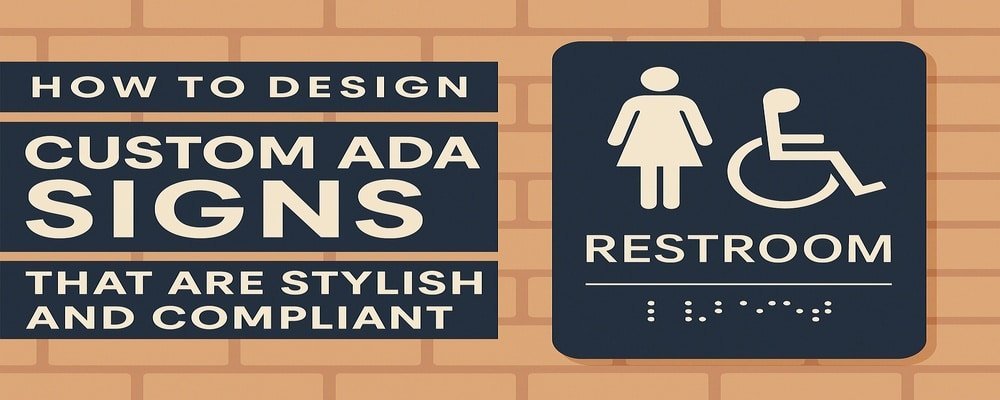
Step 3 — Incorporate Braille and Tactile Text Correctly in ADA Sign Design
Braille isn’t just an add-on — it’s a required feature for most ADA signs. It must be placed directly under the text, with precise spacing and depth to ensure accuracy for touch reading. Tactile lettering, which is raised text, helps people with limited vision.
Tip: Don’t guess braille placement. Use professional templates or have a sign company handle this detail to guarantee accuracy.
Step 4 — Pick Durable Materials for Custom ADA Signs
Your signs will be used every day and touched often. That means they need to be strong. Acrylic, aluminum, and high-pressure laminate are the most popular materials because they resist scratching, fading, and wear.
For outdoor signs, consider UV-resistant and weatherproof coatings to protect against sunlight and rain.
Tip: For businesses promoting sustainability, recycled aluminum and eco-friendly laminates are excellent options that still meet ADA standards.
Step 5 — Add Branding While Staying ADA Compliant
Many businesses worry that ADA signs will look generic, but that doesn’t have to be the case. When you design custom ADA signs, you can add logos, brand colors, and unique design touches — as long as you maintain contrast and readability.
Tip: Use your brand’s accent colors for borders or logos while keeping the main text area compliant with ADA guidelines. This way, you stay compliant and stylish.
Step 6 — Placement Tips When You Design Custom ADA Signs
Even the best-designed ADA signs won’t help if they’re placed incorrectly. Signs must be easy to locate and within reach. Restroom, exit, and room number signs should be placed next to the door they refer to.
Tip: Walk through your business as if you were a first-time visitor. If you can easily find what you’re looking for, your signs are in the right spots.
Common Mistakes to Avoid in Custom ADA Sign Design
Mistakes in ADA signage can cost you time, money, and reputation. The most common errors include:
- Using decorative fonts that are hard to read.
- Choosing colors with poor contrast.
- Forgetting braille or tactile text.
- Mounting signs too high or too low.
- Ignoring state or local building codes.
Tip: Always test a sample sign before final production. This lets you catch mistakes early.
Professional vs. DIY — The Best Approach to Design Custom ADA Signs
While you could design ADA signs yourself, compliance is tricky. A small mistake could make your signs unusable. Professionals understand the laws, use precise tools for braille, and know which materials and finishes last longest.
The cost of hiring a professional is often less than the cost of replacing non-compliant signs.
Tip: Even if you create the initial design yourself, let a professional sign company handle the final production.
Real Examples of Stylish and Compliant Custom ADA Signs
Luxury hotels often design custom ADA signs that match their upscale interiors — sleek metal finishes with high-contrast fonts and braille discreetly placed. Corporate offices use branded colors and logos to make ADA signs feel like part of the space. Healthcare facilities design ADA signs that are calm and clear to help reduce stress for patients.
These examples show how compliance and creativity can work together beautifully.
Accessibility Meets Style — Why It’s Time to Design Custom ADA Signs
When you design custom ADA signs, you’re building more than compliance — you’re building trust. Customers notice the effort you put into accessibility, and it shows them that you value all people.
With the right colors, fonts, materials, and placement, your ADA signs can be both functional and stylish. Don’t wait until you face a compliance issue — invest in custom ADA signs now to create a welcoming, professional, and legally compliant business environment.
10 Benefits of Design Custom ADA Signs
- Creates an inclusive environment for all customers.
- Ensures ADA compliance and avoids fines.
- Boosts professionalism and credibility.
- Improves customer navigation and safety.
- Customizable to match your brand style.
- Works for both indoor and outdoor spaces.
- Built with durable, long-lasting materials.
- Shows customers you value accessibility.
- Reduces liability risks.
- Increases customer satisfaction and loyalty.
FAQs About Design Custom ADA Signs
1. What are the rules when you design custom ADA signs?
ADA signs must include tactile letters, braille, high contrast, and be mounted at the correct height.
2. Can I use my business logo when I design custom ADA signs?
Yes. Logos and brand colors are allowed as long as the sign stays ADA-compliant.
3. Do all ADA signs need braille when you design custom ADA signs?
Most permanent room signs require braille, including restrooms, exits, and office identifiers.
4. What materials are best when you design custom ADA signs?
Acrylic, aluminum, and high-pressure laminate are durable and ADA-approved.
5. How can I be sure my design custom ADA signs are compliant?
Work with a professional sign company familiar with ADA standards or consult official ADA guidelines.